Building Surveying
Jul 16, 2026
How to prepare survey reports: a professional guide
Learn how to prepare survey reports effectively. This professional guide covers structure, data analysis, and actionable recommendations.

A survey report is a structured document that compiles, analyses, and presents survey data in a format that supports clear decisions. Whether you are a chartered surveyor, a property manager, or a student learning how to prepare survey reports for the first time, the quality of your report determines whether findings lead to action or gather dust. Tools like Grammarly help with writing clarity, while frameworks from platforms such as WPForms and Sopact define the structural standards professionals rely on. This guide covers every stage: structure, planning, data analysis, and recommendations.
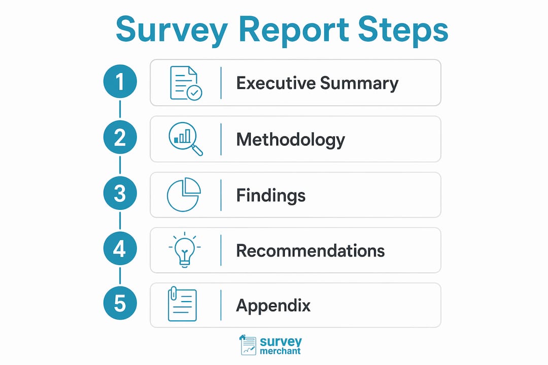
A professional survey report follows a layered architecture: executive summary, methodology, findings, recommendations, and appendix. Each layer serves a distinct purpose, and removing any one of them weakens the whole document.
Effective professional reports typically run between 5 and 15 pages, with executive summaries of 250–400 words. That range is not arbitrary. Shorter reports lose credibility through omission; longer ones lose readers through overload.

The executive summary is the most read section of any report. Busy executives often read only this section, so it must stand alone and prioritise business impact over methodology. Write it last, but place it first. Keep it focused on findings and their consequences, not on how data was collected.
Stating sample size, response rate, and collection timeframe upfront builds credibility and clarifies the limits of your findings. A report that omits these details invites scepticism. If your response rate was low, say so and explain what that means for interpretation.
The findings section carries the weight of the report. Pairing every quantitative metric with qualitative context explains the “why” behind the numbers. A bar chart showing 68% satisfaction means little without a participant quote or contextual note explaining what drove that score. Layer charts, interpretation, and participant voice together rather than separating them into disconnected subsections.
Recommendations must be specific and assigned. The appendix holds raw data, survey instruments, and supporting tables that would interrupt the narrative if placed in the main body.
Pro Tip: Write your executive summary as if the reader will see nothing else. If the key finding and its implication are not clear within the first two paragraphs, rewrite it.
| Component | Purpose |
|---|---|
| Executive summary | Standalone overview of findings and business impact |
| Methodology | Sample size, response rate, collection period |
| Findings | Charts, interpretation, and participant voice layered together |
| Recommendations | Specific actions with assigned teams and timelines |
| Appendix | Raw data, survey instruments, and supplementary tables |
Most survey reports fail at the planning stage, not the writing stage. The most common mistake is designing survey questions first and then trying to build a report from whatever data comes back.
Designing the report structure before creating survey questions ensures every question serves a specific finding. Think of it as reverse engineering. You define the conclusions you need to support, then build questions that generate the evidence for each one.
Follow this sequence when planning:
Pro Tip: Create a one-page report blueprint before you build the survey. List each section heading, the chart type it will contain, and the question number that feeds it. This blueprint becomes your quality checklist during analysis.
Surveyors working on building survey reports will recognise this logic. The inspection checklist drives the report structure, not the other way around.
Data analysis for a survey report has four distinct stages: cleaning, segmenting, integrating, and visualising. Skipping any stage produces a report that misleads rather than informs.
Raw survey data always contains errors. Duplicate entries, incomplete responses, and out-of-range values all distort findings. Remove duplicates first. Then filter out responses that fail completion thresholds, typically those that answered fewer than 70% of questions. Flag outliers for separate review rather than deleting them outright, as they sometimes reveal the most important insights.
Aggregate data hides patterns. Segment respondents by relevant characteristics: property type, tenure, geographic region, or role. A satisfaction score of 72% across all respondents tells you little. The same score broken down by property type, showing 91% for commercial and 54% for residential, tells you exactly where to focus.
Integrating qualitative and quantitative data workflows produces richer, more credible findings. Run your quantitative analysis first to identify the key patterns. Then search your open-ended responses for quotes that explain those patterns. Match them deliberately, not selectively. Cherry-picking quotes that only support your preferred conclusion undermines the report’s integrity.
Charts must communicate their main message within three seconds to be effective. This is the 3-second rule, and it is a practical test you can apply to every visual before it enters the report. Cover the chart title and ask a colleague what the chart shows. If they cannot answer in three seconds, simplify it.
Pro Tip: Audit every chart in your report against three criteria: does it have a clear title, are the axes labelled, and does the key finding appear in the title rather than the caption? If any answer is no, revise before publishing.
Use bar charts for comparisons, line charts for trends over time, and pie charts only when you have fewer than five categories. Avoid 3D effects, excessive colour, and dual axes unless the comparison genuinely requires them. For professionals working in property management, guidance on construction reporting tools can help you select the right software for producing compliant visuals.
Findings without recommendations are observations. Recommendations without evidence are opinions. The strongest survey reports connect every recommendation directly to the finding that justifies it.
Recommendations should read like a project plan, with assigned teams, specific actions, and realistic timelines. A recommendation that reads “improve tenant communication” is not actionable. One that reads “property management team to introduce monthly written updates by Q3 2026” is. The difference is specificity.
Prioritise recommendations by two factors: impact and feasibility. High-impact, low-effort changes belong at the top. Low-impact, high-effort changes belong at the bottom or not at all. This prioritisation signals to stakeholders that you understand their constraints.
Successful survey reports close the loop by turning data into clear project plans rather than wish lists. Assign each recommendation to a named team or role. Set a review date. Include a column for status if the report will be revisited.
Interactive live reports are replacing static PDFs for stakeholder engagement. A live dashboard lets readers filter by segment, drill into subgroups, and explore the data without requesting a new report. For property managers presenting findings to boards or investors, this format significantly increases engagement and follow-up action.
Pro Tip: Include a one-page action summary at the end of your recommendations section. List each recommendation, the responsible party, and the deadline in a simple table. Stakeholders who skip the full report will still leave with a clear to-do list.
The most damaging mistakes in survey reporting are not technical. They are structural and presentational.
Reviewing what to expect in a building survey report gives useful context on how professional surveyors structure their own outputs, which translates directly to survey report best practices.
A professional survey report succeeds when it pairs transparent methodology with integrated data analysis and recommendations specific enough to assign, schedule, and act on.
| Point | Details |
|---|---|
| Structure before questions | Design the report layout before writing survey questions to ensure data supports findings. |
| Transparency builds trust | State sample size, response rate, and collection period in both the methodology and executive summary. |
| Integrate data types | Pair every quantitative chart with a qualitative quote to explain the numbers, not just display them. |
| Recommendations need owners | Assign each recommendation to a named team with a specific deadline, not a general aspiration. |
| Apply the 3-second rule | Every chart must communicate its core message within three seconds or it needs simplifying. |
The single most common error I see from surveyors and property managers is treating the report as an afterthought. They design the survey, collect the data, and then wonder why the report feels disjointed. The report structure should exist before the first question is written. That discipline changes everything.
The second lesson is harder to accept: most stakeholders will not read past the executive summary. That is not a failure of the audience. It is a failure of the report. If your key finding is buried on page nine, you have not written a report. You have written an archive. The executive summary is the report. Everything else is evidence.
I have also watched the shift from static PDFs to interactive dashboards accelerate considerably in property management contexts. Boards and investors increasingly expect to filter data themselves rather than receive a fixed snapshot. If you are still producing PDF-only reports for senior stakeholders, you are behind the curve. The technology to produce live reports is accessible and the uptake among professional surveyors is growing. Surveymerchant’s network of qualified surveyors already reflects this shift, producing reports that meet current professional standards rather than those of a decade ago.
— Surveymerchant Editorial Team
Producing a credible survey report starts with quality data collection, and that starts with the right surveyor.

Surveymerchant connects property owners, buyers, and managers across the UK with qualified, impartial surveyors who produce detailed, structured reports meeting current professional standards. Whether you need commercial property surveys with full written findings and prioritised recommendations, or building surveying services for residential or mixed-use properties, Surveymerchant matches you with the right specialist for your specific brief. Every report delivered through the Surveymerchant panel is designed to inform decisions, not simply document observations.
A professional survey report must include an executive summary, methodology, findings with integrated visuals, recommendations, and an appendix. Transparency about sample size and response rate is non-negotiable for credibility.
Most effective survey reports run between 5 and 15 pages, with executive summaries of 250–400 words. Anything longer should use appendices to keep the main body readable.
The 3-second rule states that every chart must communicate its main message within three seconds. If a reader cannot identify the key finding that quickly, the visual needs simplifying.
Recommendations must include a specific action, a responsible team, and a deadline. Vague suggestions such as “improve communication” are not recommendations. Assigned, time-bound actions are.
Interactive live reports are increasingly preferred for stakeholder engagement because they allow readers to filter and explore data segments directly. Static PDFs remain appropriate for formal submissions and archived records.
Survey Merchant provides vetted RICS surveyors across 100+ UK locations at fixed fees:
→ Level 2 Home Survey (HomeBuyer Report)
→ Level 3 Building Survey (full structural survey)
→ RICS Red Book property valuations
→ Party wall surveyors — notices, awards & schedules of condition
→ Expert witness surveyors — CPR Part 35 reports for property disputes